Pages

Showing posts with label Color. Show all posts

Sunday, March 4, 2012

A Week in the Life


Hello fine folk of the interwebs. I have been meaning to put up process drawings for some time now, and to answer a number of other questions I just decided to upload everything I painted in the past seven days. Here goes....


To introduce myself to the project, I did a quick painting to feel the mood of the movie. This is very artsy sounding, but then again, you are reading the blog of an artist =)


The current visual development project is to design a scene from the Fifth Element that wasn't in the movie.


My process usually starts with thumbnails (very small and quick versions of the final painting) to get the feel for the shot.

With this assignment I decided to design a fertility shrine on the pleasure planet Floston Paradise.


What peaked my interest was just how amazing a planet would have to be to motivate someone to travel, outside of the solar system for a short vacation. This place would need to make Hawaii look like a dump.


I realized that if water and rocks could float, the environment would seem completely magical. I decided that some of the sand was made of a superconducting silt. Of course, problems arose with that idea.


If the water is so low density that it can float, swimming in it would be similar to swimming in a cloud..... it wouldn't work well.


Furthermore, the water would be highly conductive.... as would everything else. This, by the way, is my first attempt at animating straight away in color. It's a total blast. I did a couple other short animations this week, but they weren't quite as interesting so I left them out.


Of course local plant life, like these giant flying lily-pads, would gain oddly gravity defying traits.


I find that sometimes, my personal work ends up influencing my decisions. For example, this speed painting made me realize that a fertility shrine would likely have some sort of guardian statue.


These thumbnails were a result of that caustically colored painting.


After thumbnails and idea sketches, the line drawing is the next step. I put in some value for a little added clarity.


Of course then it struck me that this still has to feel like it belongs in the fifth element. So now I have to go back to thumbnails. Ah well.... such is the process.


This is just a fun little painting I did to show the location as it would be seen on a tourist pamphlet. The rest of my paintings are personal.


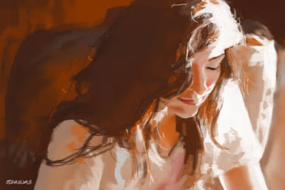
This was a three hour painting from a model. As with most of my personal work, it is both a study and a time for relaxation. The rest are all speed paintings between ten minutes to an hour each.


Some seem to work pretty well.

Others don't work quite as well.


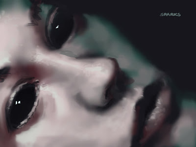
And just like a sketchbook, odd themes start to come up. For example, red eyes...


...and the relationship between this small creature and its captors.


Every once in a while, you need something to make you think outside of your normal process. I was in Cafe Frascati today with my dear friend Steven Celiceo and we decided to give ourselves a challenge. We decided that we would do one hour speed paintings based on words that someone else gave us. We asked for two random words and a random color.

The words were "Fart" and "Knockers" and the color was "Green."

Yikes! That was a very long post, and it is now nearly 4 o'clock in the morning. I hope you all are having a totally splendid day! Now for bed =)

Friday, November 11, 2011

The Forest King


She tried to toss the chicken leg into the bushes, but it was too late.
He had already seen her.


Have a wonderful Friday folks =)

Friday, November 4, 2011

Communication

-the act of conveying Meaningful Information.

After four years of art school, I am very used to technical critiques of my work. Perspective, values, edges, colors, and ultimately those are all critiques that prepare us to produce work that is worth the time it takes to give a painting a true critique. By that I mean that I am not learning how to paint so that I can make pretty pictures. I want to use painting as a means of communication. Value, color, edges, rendering, perspective, etc are all the basics of communication - as verbs, nouns, adjectives, punctuation, etc are the basics of communication in linguistics. As anyone who has studied a language understands, these things barely allow a person to ask where the bathroom is. It takes a great deal of developing these skills before any true communication can come about. The same is true in the world of illustration.


As artists, we are striving to have a conversation through images. The viewer asks "what is going on?" Ideally the piece says a bit. The one above says "I'm a kitchen." Inherently we look for other cues that can tell us about what we are looking at. Unfortunately, no matter how many questions can be answered by a painting like this, it is ultimately a conversation without a point. Since it is just a kitchen, there is no reason to care about it.

After a mess of grammatical changes, I decided to place a character in the scene. Now there is a new level of conversation. We still understand that it is a kitchen, but there is now a kid standing ridged with something in his hand. If we can see that he is holding a pair of scissors, the next question is why. Without further corrections, there is no way that the viewer can answer that question. I will update this when I have corrections to this particular story.

Each of the following pairs of paintings is another story I am trying to tell.


These were all quick sketches to help me determine exactly what story I wanted to tell. I ultimately settled on the following story.


Unfotunately
, this particular assignment is to tell a story about a tree fort--not about the kids who built it. So, Instead of making corrections to these two paintings, I have started new paintings that better fit the assignment. It's all the maddening and fascinating process of learning a new language. Some days I feel like I can put a sentence or even a small dialogue together, but most of the time, I still feel like I am waving my arms, pointing, and drawing stick figures in the dirt.

I hope ya'll have a fantastic Friday =)


Monday, August 1, 2011

Ukulele


I just dusted off my ukulele! Its delightful how such a small piece of carved wood can bring so much untempered joy. This particular piece of wood holds a special significance because it was given to me by three of my dearest friends! Playing music has such healing properties.

So.... art!

(Masterwork Study of John Bond Francisco)

I've done a couple masterworks from Photoshop artists, but this one was my first from a traditional painter. I learned from the Photoshop painters that I can simplify a LOT more than I do. There were tricks that I picked up from them. I was hoping to find similar tricks about color from working on this John Bond Francisco piece. He didn't use any. He just observed the correct shape value and color.


I've been skating by thus far with my Photoshop paintings. I've been depending on the fact that if I put down a swatch of color that is incorrect, I can just go over it and change it. With the way I have been painting, were I using acrylics, the paint would be caked on. I have thus far lacked precision. Realizing that I have to do more work to be better is obvious, but always a little maddening. I sometimes wish I could just go out to the store and buy the pack of "painter" pills, take them, and be totally brilliant.


I truly love this guy's facial expression. I think this is sort of what I see when I think of what a brilliant painter would look like.


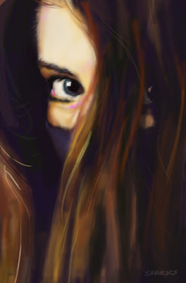
I've also been playing with edges. This is one where I roughed it in and then painted it almost entirely with the blending tool. Like the others, it was done in 30 minutes from a photograph. I realized, while painting this one, that I couldn't just use the blend tool for a painting. There is an interesting quality to it, but it's just to soft and mushy.


Here I tried to use mostly the blend tool and just add accents with the paint brush. Here again, it is an interesting effect, but it lacks precision.


This one is a pretty even combination of the two and I started to like the direction this one was taking. Also I've been noticing how drastically different these paintings look on other computers. I've been told it's a matter of screen calibration. My monitor shows me more range at the bottom of the spectrum than usual. So with this one I just eliminated the bottom of the spectrum.


With this one I wanted to start playing with getting skin to feel like skin. Those little bumps and ridges that skin has are so distinctive. The right side of her face (the side on the right of the painting) is beginning to get there, but it feels a little furry to me.


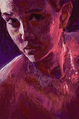
With this one, I put down an initial layer, used the blending tool and then put the brush at full opacity. I wanted to see how much of the edges i could put in with squiggly lines. It's an interesting look, but I am not fully satisfied with it. It just looks messy.


So I used the blending tool. This second image is almost entirely done with the blending tool with the previous painting as the base. I am happiest with the left side of her face and the oddly implied necklace. For some reason, the necklace fading in and out of being defined really makes me happy.


There are a bunch of things I don't like with this one, but there is something pleasingly urgent about that facial expression.

Well fine folk, without further adieu, I am going to go eat some Chinese food and play my ukulele =)
Have a fun night folks!